Description
This project examines the Vanier Interactive Map (available at map.vaniercollege.qc.ca) in order to consider its effectiveness as a mapping tool, focusing on the navigation of the landing page.
Project
Generally, maps are used as reference tools to orient users in space (for example, the common "You Are
Here" designation), for wayfinding (getting from Point A to Point B) and pinpointing locations (i.e.,
simply knowing where a specific location is in relation to other geographic information). The design and
usability of a map either fulfills the needs of the user or it fails. Understanding your user is key to
good map design, followed closely by simply understanding how to design a good map; Both understanding
the user and understanding good map design are critical parts of good UX (User Experience) and UI (User
Interface).
Our case study examines the Vanier Interactive Map: We begin by considering Vanier
Interactive Map personas, followed by an analysis of the navigation of the landing page. We offer
recommendations for improvement and present a possible re-design of the landing page, with general
suggestions for enhancing the UX/UI of the Vanier Map site such as simplifying the menu, ensuring design
consistency, and providing clear information.
Personas
Analysis
Landing Page
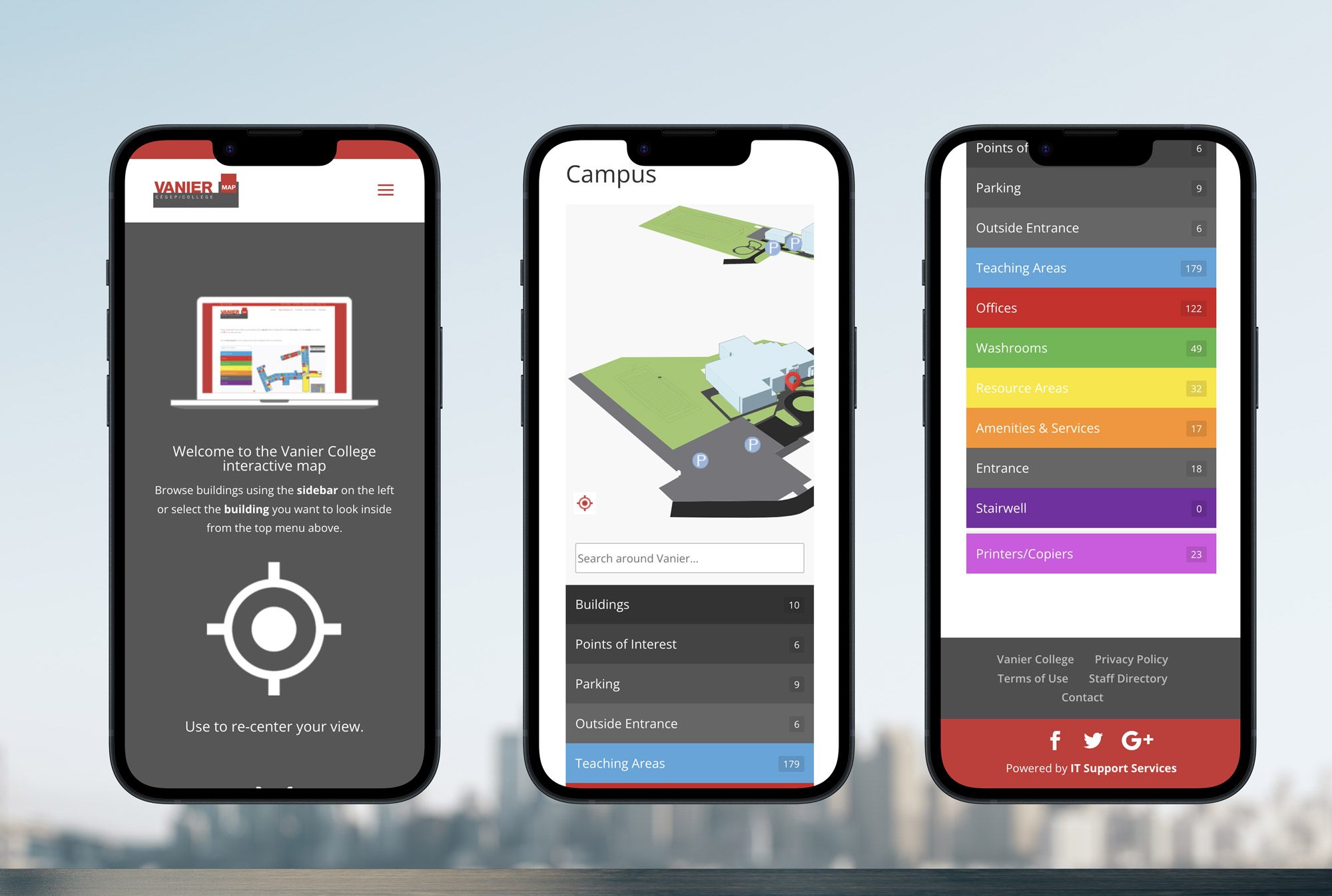
The first things you see on the page: a mock-up of the map, a centering icon and a bird’s-eye view of the campus. These three visual elements look like they are clickable, but are not. If you click the arrows under the centering icon, the page scrolls down to the map and a search bar with colour coded accordion menus, and the drop-down menu in the header scrolls up and out of reach.
Drop Down Menu
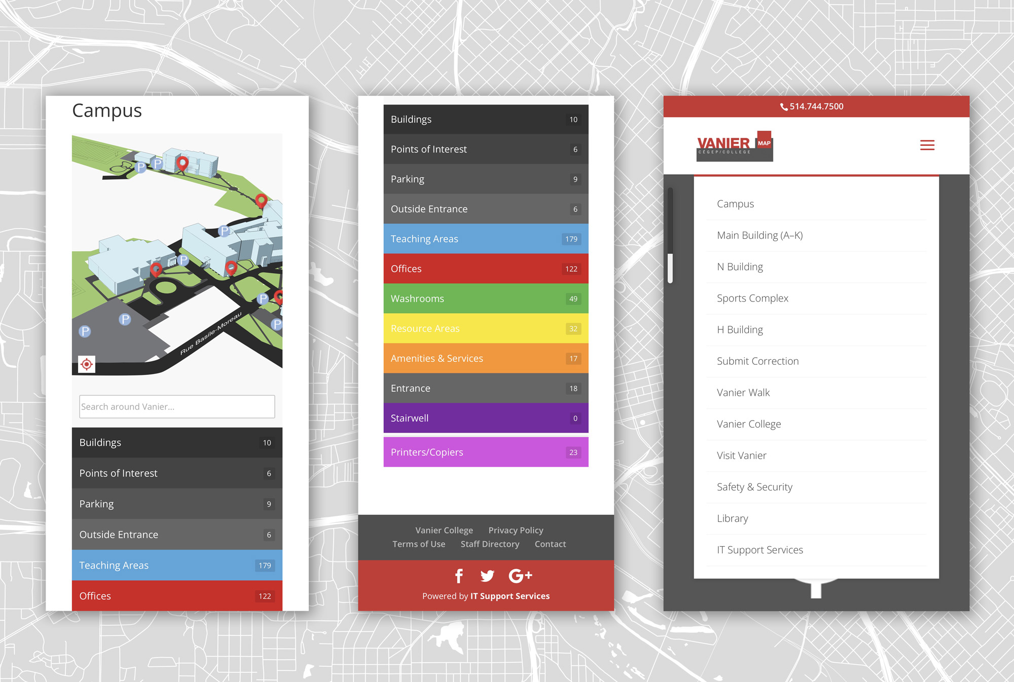
In the header, the drop-own menu gives 5 mapping options (Campus, Main Building (A-K), N Building, Sports Complex, and H Building), 5 links to other Vanier pages (Submit Correction, Vanier College, Visit Vanier, Safety and Security, Library, and IT Support Services, etc.) and a link to Vanier Walk (interesting, but not covered in this report).
Main Building (A to K)
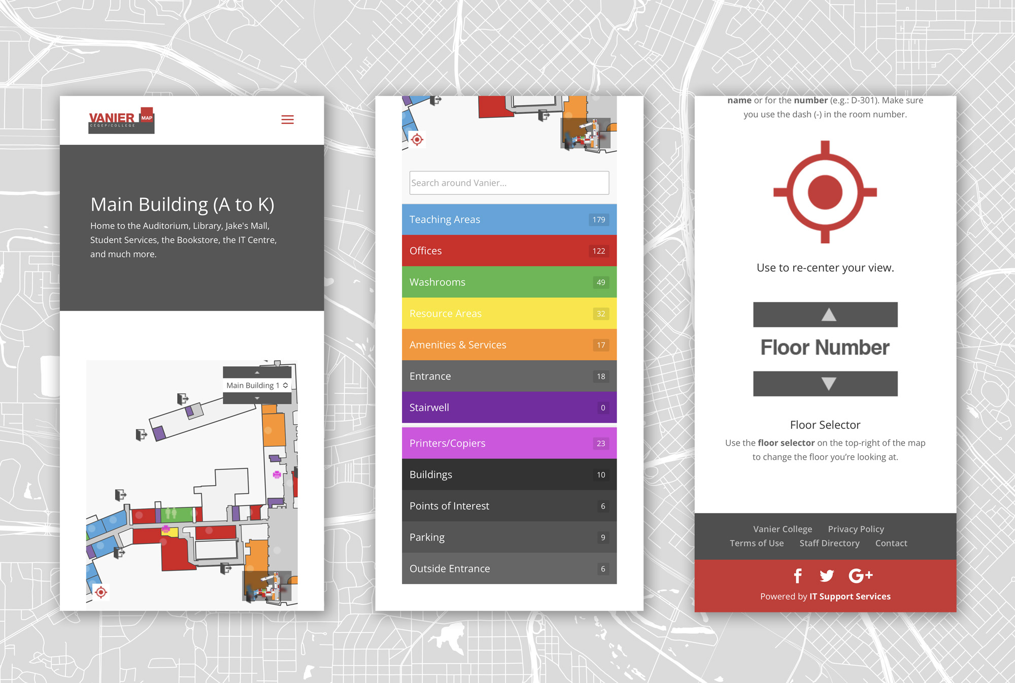
When you click on the Main Building (A to K) link in the drop-down menu, you arrive here (see image below). Users enter the room numbers or location in the search bar under the map, but there is no explanation of how to do this properly. There is also a drop down menu on the Main Building map labelled Main Building 1, which users confuse with another building name. (This is easily resolved by naming this menu “Floor”.) You must scroll down on the page to get explanations for how to use this map properly. Generally, the more the user has to leave the map to gather information about using the map, the weaker the map is.
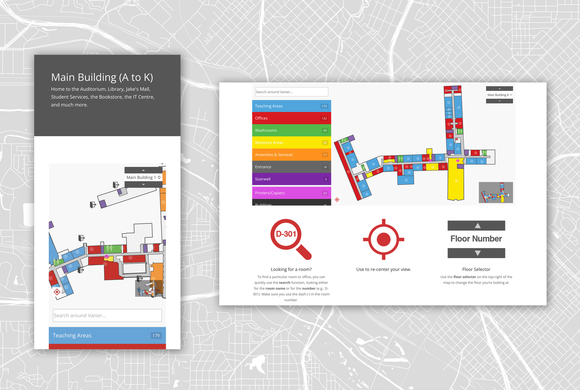
Having apparently 11 (A through K) “Main Building” (Buildings?) is confusing for someone new to Vanier Campus. And why is H Building in a different category if it should be in the Main Building (A-K)? And what is N Building? What happened to Buildings L and M?
In the Main Building (A to K) section, users are shown a partial view of a (some?) building(s), with the option to choose Main Building 0 through 5. What are Main Buildings 0-5 doing on a page for Main Building (A to K)? And who names a building “0”? If the user hasn’t yet scrolled down on the Main Building page to read the explanations, their confusion is growing.
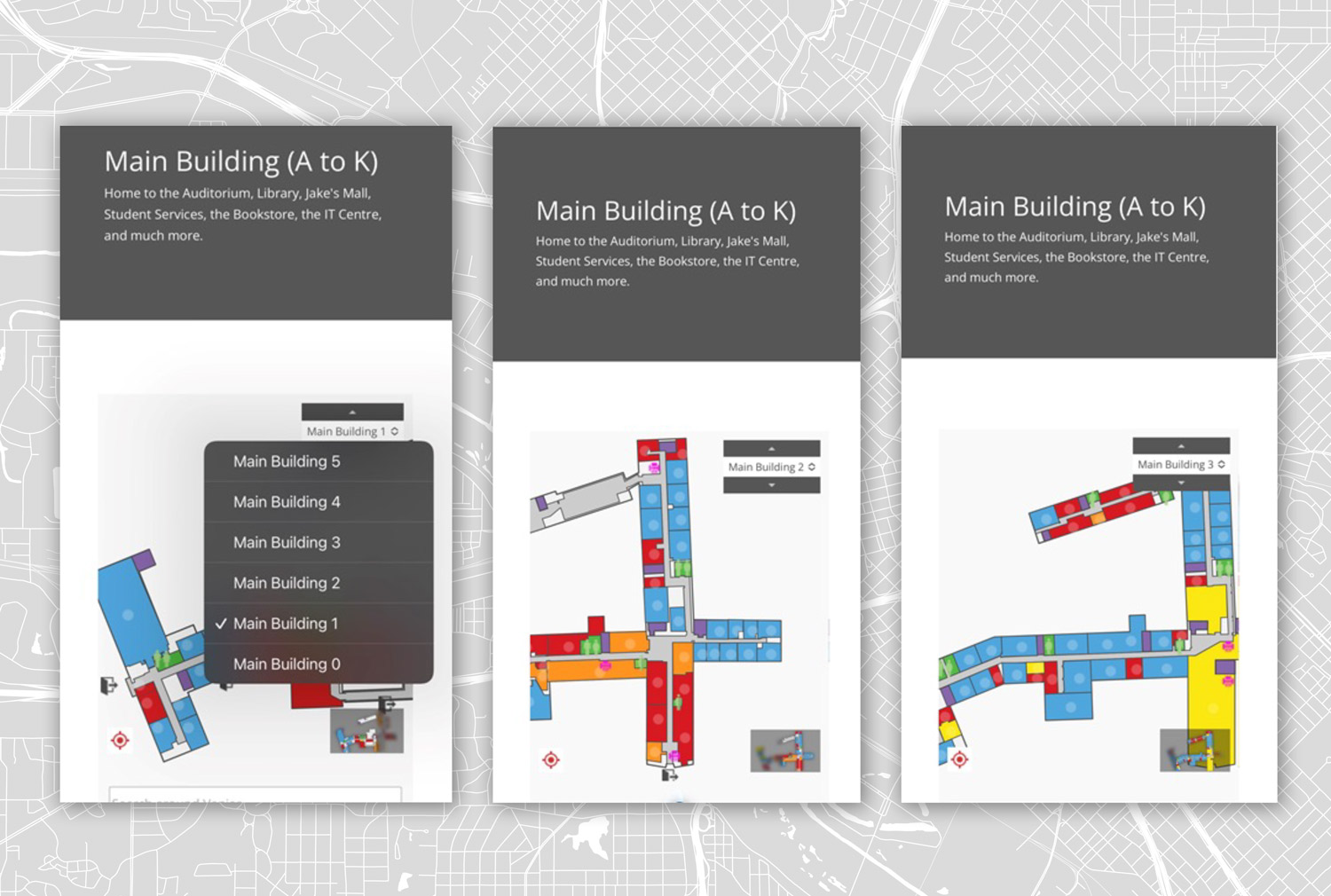
There is a small “legend” map in the lower right corner where the user can click to highlight (in the “legend) and then see (on the screen) a specific building with the layout of the floor of the building (Main Building 0-5) displayed in a drop-down menu in the upper right corner of the main map. This is a great feature, but the user might not yet know what Building 2 or 3 are, or how they relate to Main Building (A to K).
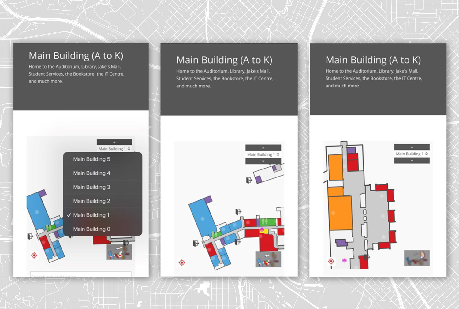
Once on the Main Building page, the user can click in the “legend” map to see a specific building and the floor of the building (Main Building 0-5) will be displayed. However, if the user scrolls to another building, the “legend” map updates to the new building while the Main Building # (0-5) remains the same. If users think that this is the name of the building, it creates confusion.
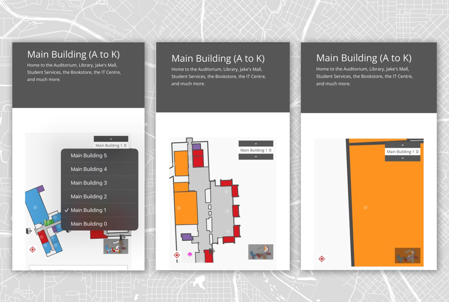
On the maps there as light dots in many of the “rooms” that tempt the user to tap on them. When the user taps the dots, the map zooms in but does not display any additional information. This is frustrating and confusing to the user.
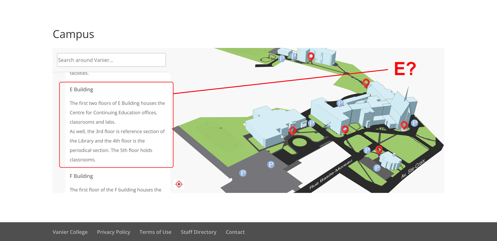
Most building and room combinations (here, E-413) result in nothing, not even an error message. The map does not show the correct ( E ) building.
Summary
The Vanier Map suffers from basic orientation issues: A “You are here” icon, a north arrow, streets or other outside visual cues could be included to provide the user with a sense of where they are and how to get to where they would like to go. The map just shows a building floating in space. It seems to assume existing knowledge of the campus.
From the perspective of someone walking around on campus, especially someone who is already INSIDE a building trying to find their way, the buildings in Main Building (A to K) are not experienced as independent buildings at all, but wings or sections of one vast, interconnected building. The labelling of spaces can confuse the user.
Improvement
Recommendations for enhancing the UX/UI of the Vanier Map site include focusing on the main page layout, simplifying the menu, ensuring design consistency, and providing clear information.
To improve the main page, the menu will be streamlined to feature only 5-6 items, preventing an overwhelming amount of information. The proposed MENU items are as follows:
- Buildings: Displays a directory with office and classroom numbers.
- Visit Vanier: Consolidates map and information about open hours and days for campus visits.
- Vanier Walks: Opens an interactive, photo-realistic map of the green areas surrounding the campus.
- Parc Ex Campus: (new addition) Redirects to a dedicated page with campus information and maps.
- Student ID’s: Retains the current IT Department but suggests a clearer name, such as Student ID’s or Photo ID’s.
- Services: Redirects to common services such as the Library, eating areas, bathrooms, etc.
Graphics and images on the page will be simplified, retaining only essential elements like the Vanier logo. Unnecessary graphics that contribute to confusion and navigation difficulties will be removed.
A search bar with autocomplete functionality has been incorporated to facilitate efficient error handling. The autocomplete feature prevents errors by restricting searches to listed buildings and aids in preventing typos by suggesting and completing office numbers as the user types. Additionally, a button has been added to enable searches by staff member names, providing users with the ability to locate offices even without specific information.
The map will be centrally displayed on the screen to minimize scrolling. It will also consider the user's location, provide navigation information, indicate cardinal directions, and display the distance from the user's point to the desired result. Additional campus information, such as terms of use, contact details, and feedback options, will be placed below the map.
The footer will retain links to Vanier's social media accounts for continued engagement.
The staff page will maintain the same aesthetic, but the search functionality will be linked to the staff members' database instead of the buildings database. This consistent approach will also apply to the Parc Ex Campus page, ensuring uniform navigation across all sections of the website.
Proposal of Design
Conclusion
The Vanier Interactive Map is an important tool for students, teachers and visitors to use in order to be comfortable navigating Vanier College. We identified several problems on the landing page, including frustrating navigation, unclear campus models, confusing information and overwhelming visuals.
Our recommendations to enhance the UX/UI experience focus on simplifying menus and search fields as well as streamlining the process of finding information and locations. The goal is to retain and simplify essential information, highlight new search options within existing databases, and improve the overall visual design. These recommendations involve eliminating confusing static maps by replacing them with a single interactive map for immediate clarity, and minimizing unnecessary navigation and scrolling. Key additions include a prominent search bar at the top of the page with autocomplete functionality to prevent typos and to facilitate searches for existing offices. Additionally, the option to search by staff member allows users to locate a teacher's office by name. This approach is designed to create an intuitive navigation experience for various users, including students searching for classrooms, one-time visitors seeking information offices and teachers accessing resources.
© 2023 Sara & Lesmy & Moonhee
